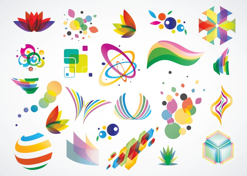
Choosing the right logo
Choosing the right logo for an online shop can be a crucial factor in creating a memorable brand identity. Here are some tips to help you choose the right logo:
- Keep it simple: A simple logo design is easier to remember and can be easily recognized, even at small sizes.
- Make it relevant: Your logo should reflect the products or services you offer. For example, if you sell eco-friendly products, consider using green or earth tones in your logo.
- Choose the right colors: Colors can evoke different emotions and convey different meanings, so choose colors that align with your brand’s values and messaging.
- Make it scalable: Your logo should look good in any size, whether it’s printed on a business card or displayed on a billboard.
- Avoid trend-based designs: Trends come and go, but a timeless logo design will stand the test of time.
- Consider typography: The typeface you choose can have a big impact on the overall look and feel of your logo, so choose wisely.
- Test it: Get feedback from friends, family, and customers to see how well your logo is received and make changes as needed.
Ultimately, your logo should be a representation of your brand and help to establish a memorable and recognizable identity for your online shop.
The best sizes for logo design
The best sizes for logo design will vary depending on the intended use and context in which the logo will be displayed. However, here are some general guidelines for logo sizes:
- Square format: A square format is best for social media platforms such as Instagram or profile pictures, and the recommended size is usually between 400×400 and 600×600 pixels.
- Horizontal format: A horizontal format is best for websites, letterheads, and business cards, and the recommended size is usually between 800×200 and 1000×400 pixels.
- Vector format: A vector format (such as .ai or .eps) is ideal for print materials, such as brochures, banners, and packaging, because it allows for resizing without loss of quality.
- Favicon: A favicon is a small icon that appears in a browser’s address bar, and the recommended size is usually 16×16 or 32×32 pixels.
It’s important to note that these are just guidelines, and the specific size of your logo may vary depending on your individual needs and the platforms or materials in which it will be used. However, it’s always a good idea to have multiple versions of your logo in different sizes, so that you have the flexibility to use the most appropriate version for each situation.
The number of colors
The number of colors in a website logo depends on several factors, including the brand’s identity and the intended use of the logo. Here are some general guidelines:
- Two to three colors: A logo with two to three colors is simple, memorable, and easy to recognize. This is a good option for logos that will be used on websites, business cards, and other digital materials.
- One color: A single-color logo can be effective for logos that will be used in monochromatic contexts, such as black and white print materials or as a favicon.
- More than three colors: Logos with more than three colors can be complex and difficult to remember, but they can also be useful in creating a distinct, memorable brand identity.
Ultimately, the number of colors in a logo is a personal decision that will depend on the specific needs and goals of the brand. It’s a good idea to work with a professional logo designer to help determine the right number of colors for your brand’s logo.


Leave a Reply
You must be logged in to post a comment.